Arranging coloured tiles according to lightness/value
DESCRIBING COLOURS:
Lightness/value and Chroma
Sort hue families by the lightness/value attribute
Details:
Middle-high school and up
Time: 20 minutes
Learning Outcomes: Identify the lightness/values of various coloured tiles by matching them to their ‘grey partner’ on the greyscale.
Colour Concepts:
Recognize that each colour has its corresponding ‘grey partner’, i.e. a grey which matches its lightness/value.
Realize that lightness/value is one of colour’s attributes
Materials:
Coloured tiles: physical, or online at: https://5drealities.itch.io/colour-lit-sorting (CHROMO)
Optional - use printed handout for sorting physical tiles
Instructions:
See Free Sort Lesson plan for instructions on using online CHROMO sorting set.
If you have done a previous exercise, go to Menu and Clear All.

Figure 1. Sort Gray Scale selected.

Part One: Sorting Gray Scale
From the CHROMO menu, select Sort Gray Scale. See Figure 1. (Note: if you wish to sort without using the template, you may select Add 9 Gray Scale instead of Sort Gray Scale.)
Sort from white at the top to black at the bottom. See Figure 2.

Figure 2. Add Vivid Colours

Figure 3. Match Vivid Colours to Grey Partner.
Part Two: Sorting Vivid Tiles
Go to Menu and select Add Vivid Colours. See Figure 2.
Match the vivid colours to their Gray Scale partner. See Figure 3.
Note the different Lightness/Value of the Vivid colours. Which is lightest? Which is darkest?
Go to Menu then Clear All for Part Two.
NOTE: In some cases, there may be an equal degree of contrast between the colour and two steps of the gray scale. In such cases the colour can be positioned so that it overlaps both steps of the gray scale.

Figure 4. Sort Gray Scale then Add 36 Colours.

Figure 5. Move green tiles to open space.
Part Three: Sorting Hue Families by Lightness
Select Sort Gray Scale again and sort from black to white.
Select Add 36 Colours. See Figure 4
Choose the green hue family and move the four colours from that hue family to the open space next to the Gray Scale. See Figure 5.
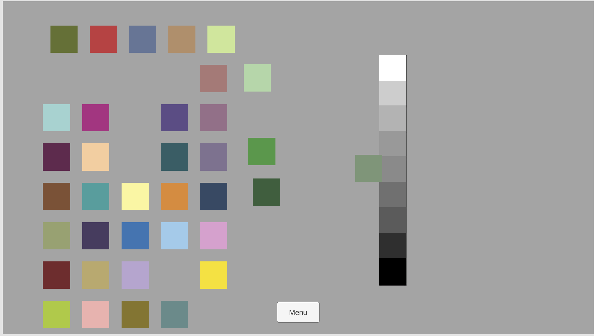
Figure 6. Find the ‘grey partner’ of the muted tile.
Move the muted green coloured tile so that it overlaps the gray scale and then move it up and down the scale until you find the position on the scale where the contrast between the muted colour and a step on the gray scale is least distinct.
This step on the grey scale will represent the lightness/value for the colour and can be referred to as the colour’s ‘gray partner’. See Figure 6.

Figure 7. Find the ‘gray partners’ of the pale and dark tiles.
Repeat this process with the pale and dark colours. See Figure 7.

Figure 8. Green hue family placed in relation to the gray scale.
Repeat the process with the vivid coloured tile. In case the vivid tile has a similar lightness/value to that of the muted colour, you can move it up and down on the other side of the gray scale. See Figure 8.
Repeat the process with other hue families. See Figures 9 and 10 for examples.

Figure 9. Matching the red hue family to the gray scale.

Figure 10. Matching the yellow hue family to the gray scale.
Following this exercise, you are ready for the Arranging Chroma exercise.
Vocabulary:
Lightness/value, Greyscale, Colour Attributes
Questions & observations:
Which vivid tile has the highest lightness/value? Which has the lowest lightness/value?
Which tile overall has the highest lightness/value? Which has the lowest lightness/value?
Which pale tile has the highest lightness/value?
Which dark tile has the lowest lightness/value?
What’s going on?
The character attribute known as lightness/value is one of the three dimensions of colour, along with hue family and chroma. The purpose of this exercise is to understand the importance of the lightness/value of a coloured tile in order to fully specify its three-dimensional description. This exercise will also teach how to quantify a colour’s lightness/value given an achromatic scale (or grey scale) as a reference.
Find out more:
For a deep-dive into lightness/value, see David Briggs’ website entry on The Dimensions of Colour: Lightness